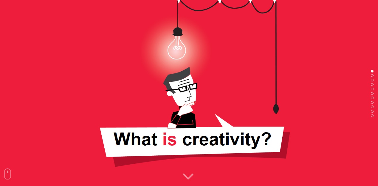
“What is Creativity?” is a creative, long
one-page website that I came across. This website uses very simple, vector,
retro-style illustration and plain-colored background. This website defines
creativity through nine chapters. I had fun navigating through the site to see
all the animated illustrations and learning about creativity. The pros of this
website is that it does a good job briefly explaining the content. It is easy
to browse through each chapter especially thanks to the readable fonts used for
each category. The only con that I could see was that the webpage felt like a
Power Point. The animations are smooth and nice, but it would be more interesting
if it was more interactive.
Tuesday, September 30, 2014
Html5 Website 2

This is my favorite site which features a
very fun, cool, and creative design that everyone can appreciate. The website
is called “Silk”. The site uses many HTML5 features and encourages visitors to
generate colorful artwork through their browser. How do you use this website?
Choose as many colors as you want, click any place to start, and just draw on
the webpage. There are other options to make your artwork even more creative.
You can also save your work as a PNG file. This site makes all visitors become
artists right away! I created some artwork and uploaded mine below. Please take
the time to experience this creative website!


Html5 Website
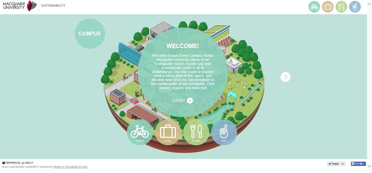
I found this website featuring MacquirieUniversity which is basically a campus guide with ecological tips. The design
looks simple, but pretty. When you click any of the cute circular bubbles on a
place or object, it pops open a guide as to what it is or what you can do for
the ecology. I love the object and icon illustrations of the website because of
how cute and colorful they are. It’s a very fun way to look at a guide!
One Page Website 2
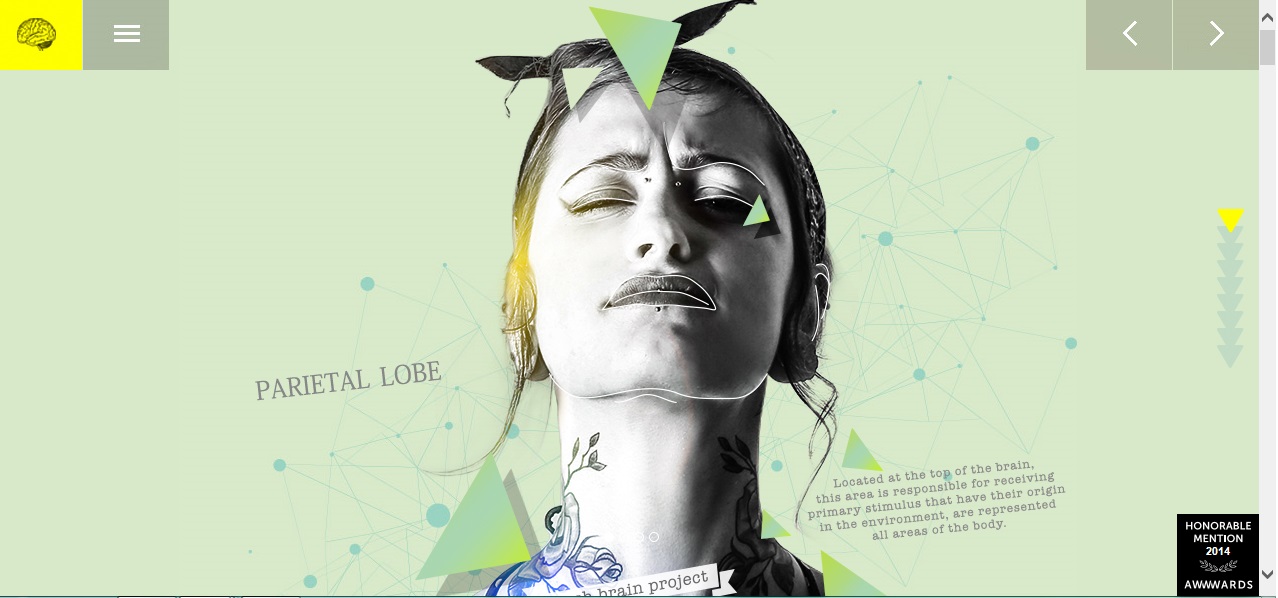
I love this one page design because of how
creative it is. I love the design’s combination of illustrations, phots,
videos, colors, and fonts. When I scroll through the website, each section
contains pages which can viewed by clicking the left or right button. Some
pages will include videos, pictures, and links to other websites. It is fun to
see everything, but I would recommend making the fonts a little easier to read
because I had to zoom in and scroll more frequently to read it all. However,
this website has a really nice and cool design overall, and would like to make
my own webpage similar to this.
One Page Website

I came across this website, Bunt Spenden,
while looking for a one page website. This site is a campaign that collects
signatures to change the law for gay and bisexual men to enable them to donate blood
in Germany. I love how the illustrations are animated as you scroll through the
page. This site has a very well built design which makes it easy to view. The
illustrations, designs, and colors are very nice and simple. It makes viewers want
to go until the end of the page just like looking through a flip/children’s
book. It also makes it easier for the viewers to understand what message and
goal of the website is.
Wednesday, September 17, 2014
Daniel Sternlicht

This is one of my favorite websites! When I visited Daniel Sternlicht’s website, it amazed me! I felt like I was playing a game that had I played before in my youth. It was fun to move the main character (Daniel) in his own website. His ideas and inspiration gave me a fun and exciting experience. It also reminded me that I can’t spend more than one hour playing a game. This website was fun to visit, and is one that I will never forget.
Marco Rosella

I love this design! Marco Rosella is a designer
and developer. His work is very nice, clear, and creative. I love this website’s
design because the screen will zoom in to open up the next page. The colors
that he uses for all his work is so very calm and nice that people could view
his page without getting tired of it!
Roth Aniko & Kilfish

The Roth Aniko’s website is one that I find
very interesting. I love this website’s homepage because it is very artistic
and creative. When I looked at his artwork on his web page, I felt excited
because it felt like I was looking at a children’s book or animation. His
website is designed by Kilfish who is a web designer. Once you see Kilfish’s
design, you instantly see how clear and fun the page’s design is. Go to Kilfish’s
website to see his portfolio and contact information.
Sunday, September 7, 2014
Kashiwa Sato

http://kashiwasato.com/#
Tuesday, September 2, 2014
The Frequently Visited Website

This is the website that I frequently visit. This website usually publishes news about entertainment, especially about video games. I like to go to this website because it shows a lot of news and popular games. It also shows a lot of sales and discounts when they happen. I also like the site's design because it is very simple. You can pick any news topic from the right side scroll down menu, and you can see other popular stories on the scroll down left side menu. Just simply look at what pictures/descriptions are interesting to you and enjoy!
Subscribe to:
Posts (Atom)