Astronomyy.fm website.This is realy beautiful website. The web designed as a kaledoscope. It is simple and fast to know their songs. Enjoy the music and the view!
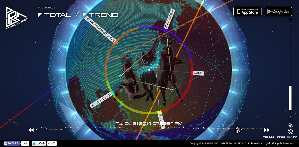
Perfume is one of my favorite artists in Japan. I would like to introduce this artist’s website because I have never seen a website as awesome as this artist’s website before. This artist has two websites which are the official website and the official global website. The official website is designed well and is for normal visitors that can check on the artist’s information. However, the official global website is very different from the official website. The global official website is designed very creatively featuring an electronic-futuristic style with 3D graphics. There are links in certain sections where visitors can create and play some videos too! Please visit and have fun!
The webpage for Jounetsu Mariko is a
creative, one long page web design. I like the links at the top of the page
because of how nice and illustrative the fonts are. The website also features a
lot of simple white line and dot illustrations over a black background which
gives it a very unique feel. There are many photos that are used in combination
with the illustrations in the back. I would like to try and make a website
using this website as sample.
Kiss’s website is amazing. The picture of
the band and the logo makes the website very attractive and stand out. It would
easily stick to the minds of visitors as it’s kind of hard to think it is not
memorable. I like how they put a video clip in the middle of the homepage as it
gives viewers a taste of how they perform and sing. I also really love the font
because it is the same font style as the one they use in their logo.
This is Amuro Namie’s website. She is my
favorite artist from Japan. I like how the pages are oriented diagonally as you
scroll through for information regarding her albums. One page also shows a music
video for one of the pages. Other information is included at the top of the
page which links you to separate pages. Her logo is also a top page button. The
logo is a very pretty and unique design, and I love how the overall design.
Beyoncé’s website has a very simple and
unique design that I rarely ever see. The photographs are all attached to the entire
page like a collage. The photographs are links that show other photos, video
clips, and etc. Also, the site has a link on the top left corner that lets you
check out other stuff. I feel it’s a good thing that the webpage features a top
page button for better convenience.
Bruno Mars’s website features a long page
and a simple design that is easy to navigate. Each page features a picture of
Bruno Mars in the background. The site shows its links of the left side of the
website. I like the website because of easy and fast it is to find more
information about the artist. The only problem I have with the website is how
the filter that was used on the website’s background picture puts a strain on
my eyes.
One thing that I love about this website is
how one large picture is used as the background for the website. When I opened
the website the intro was very amazing. The picture is also dynamic and
features a very beautiful scenery that I wouldn’t mind staring into for a
while. When I click on a link, I can still see the background through the
paragraphs. I like when I click on the gallery, the pictures takes up the
entire space of the website.
This is Katy Perry’s website. I love the web
design overall and feel that it was designed perfectly. Each page features a
different pose of the Katy Perry. Each page also has different styles of links
which are complemented which nice images and makes each feel unique. The fonts
are very readable and are aligned perfectly. I like it when I can see the other
links on the corner of the page. If I want to go back to the homepage, I simply
click on the Katy Perry’s name which is in the top right corner of the page.
The color scheme is calm and warm which makes it a nice and relaxing viewing
experience everytime.
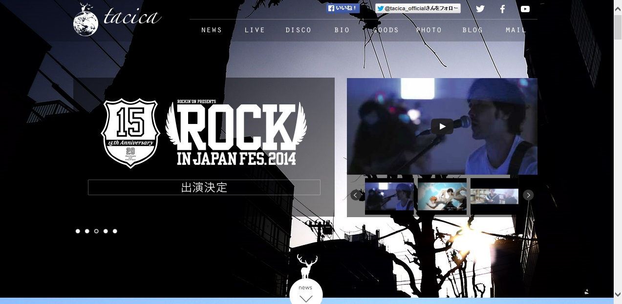
I love this website. The Tacica website’s design
is very clean and simple. I love the logo design and also like the background
picture which features a very calm and artistic scene. Each block on the page
is aligned clearly, and the colors and the fonts that are used in the design
are not only readable but also complement each other very well to create a
unique them.
BOO! It is Halloween season! This is the musician
“Red Dracul Scar Tissue’s” website. I thought this was scary and cute at the
same time. I like how tries to make visitors have some fun by clicking on the
images to watch either animations or find links. I love the artwork of
background and when the ghost is popping out! Have fun clicking on the screen!
Catcher in the Rye is the artist of this
website. I love the homepage because it has cute characters and artwork in the
background and also features a nice logo in the top right corner. I thought
this website was unique and simple (the website only has three pages). To find
the next or previous button, move around the mouse on the right area or left
area on the screen. If you want to go to other pages, slide to the left or
right.
This is website for a musician called “Clammbon.”
The image is very unique and interactive. Whenever I hover the mouse of an
image or letter, the images change into a different image which link to another
page. I want to make a homepage that is simple but attractive. The only con I
could see is how unreadable the fonts are and how long the body is for each
link. I also would have preferred having a homepage button so that I could go
back to the top.
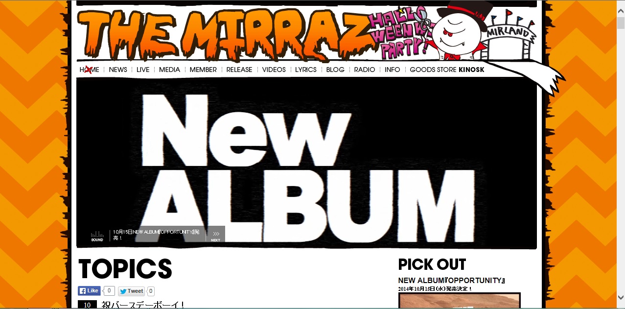
This is the Japanese rock musician’s, TheMirraz, website. The website features a Halloween design because of how close
Halloween is. I thought this site had a very nice and unique look to it. The
logo is very creative and the character is very cute. I really loved how they
put the music video ads on the home page because it makes it easier for the
viewer to know what kind of songs the band sings. The other pro is how the
links at the top of the page have very readable fonts. However, the cons are how
the entire body unreadable and too long. Because of these cons it made me stop reading
in the middle of one of the paragraphs. The fonts are squashed together which makes
it very hard to read everything. I would rather read something that is more
simple, short and straight forward.
This is Bloc Part Four’s website, which features a
simple and creative design. I also found it interesting that the website only
features six colors throughout the entire site. This is also a long page
website which does not stop at the end of the page; this is a routine style for
this type of webpage. If I want to click on a link, I can either click on the
links at the top of the page or I can click on the corresponding colored
circles in the center of the page
I have seen a lot of circular designs on a
website before, but JOJO’s website in particular has a very nice and simple
design. It features many red moving circles. I like everything on this website.
For example, all of the links are on the right side and are easily accessible despite
how long the list of options are. Another pro the website the website has is
how the circular images are all links to the designer’s works and also a link
to put the viewer back to the top. Having a “top of the page” button is
important as it makes a viewer’s life easier should they feel the need to go
back to the top. Otherwise, it is time consuming just to scroll all the way
back. Overall, the website has a very nice design.
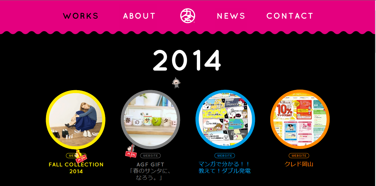
This is Tabata Shougo’s portfolio website
which is amazing and powerful and easily attracts visitors’ attention. I really
like the background of this website because of how the bubbles charmingly float
quickly upwards. The link animations are also very unique, and the works are shown
very visibly. I love how simple and clear the website’s style is.
This is Ayano Mitoma’s portfolio website. I think
the artwork is very clean and creative. I love how unique the character is and
love how colorful both the character and the background is. The website is fun
to interact with because of how the screen slides into other artworks for other
links. I would recommend the website designer to put more information about
herself so that visitors can get a better idea of what kind of jobs she does.
Regardless, the website is very creative and fun.